Tempo
Project Duration
October 2021 - November 2021
Why Develop Tempo?
I developed this project while taking part in the Google UX Design Certificate Program, which asks students to select a prompt from a random generator.
My challenge prompt for this project was to “Create a Music-Sharing App for a Dance Music DJ”.
I chose this prompt because I use Spotify and Soundcloud often, which provided me a great base understanding of the features that are currently overlooked by apps on the market.
Developing something “new” was important for me, and I hope you enjoy the experience!
Project Overview
Tempo is an efficient way for DJs to send playlists to clients and associates for feedback in advance to any event, allowing collaborators to make changes and comment in real-time so all materials are approved and organized heading into their event.
The Problem
Event DJs are constantly communicating back-and-forth with clients in order to confirm a final list of music for an event, which is time-consuming and disorganized. Clients also have to listen to playlists in one app, and then provide feedback via email or text, which can result is miscommunications, delays, and uncertainties.
The Goal
Create a music-sharing app that allows DJs to share their playlists with clients and teams in advance to events, and gather feedback quickly and easily.
My Role
UX Generalist
User Research
Secondary Research
1:1 Interviews
Usability Studies
Ideation, Design and Prototyping
All Design Ideation and Development
All Wireframing (Paper, Digital)
Low-Fidelity and High-Fidelity Prototype Design and Development
Development and review of all copy and labels
Research Summary
For this project, I performed secondary research by studying DJ forums and Discord groups to learn more about the needs of the app’s user. It was clear getting feedback was often a hassle.
I also completed a competitive audit to understand the limitations of current music-sharing apps, such as Spotify and Soundcloud, to determine how Tempo would set itself apart.
To build on my secondary research and uncover additional user pain-points, I conducted several 1:1 interviews with DJs and Cover Bands who work with clients regularly to build playlists and music lists for events. In these interviews, I uncovered pain points by following the “5 Why” method. This provided a crucial understanding of the troubles many musicians run into when simultaneously preparing for events all with different clients and deadlines.
After developing a functional High-Fidelity Prototype, I performed several Usability Tests that uncovered a need to change the the Hamburger Menu design, as well as prompted the decision to add a “Carousel” type scroll to the top icon on my homepage.
User Pain Points
Too Many Emails and Texts from Clients
As DJs scale their business, communication with clients is scattered across text, email or other apps, and not native to any music-sharing app. This makes it harder to grow efficiently without a centralized tool for collaboration and communication.
Difficulty Making Last-Minute Changes
Last-minute requests for edits can be hard to manage due to the broken nature of communication, and gathering another round of approvals prior to larger events can be time consuming.
Clients Get Overwhelmed with Approvals
Clients often feel overwhelmed having to provide feedback on a large final playlist all at once before an event, and would rather be able to add quick thoughts along the way without the need to consistently check in directly with their event DJ.
Daryl the DJ
Problem Statement
Daryl is an event DJ who needs to be able to share playlists, gather feedback from clients, and make any proposed edits all in one app quickly and easily.
Daryl’s User Journey
Daryl is always excited to be working new events, but the process of sharing his playlists, waiting for feedback, and making changes is often stressful and nerve wracking.
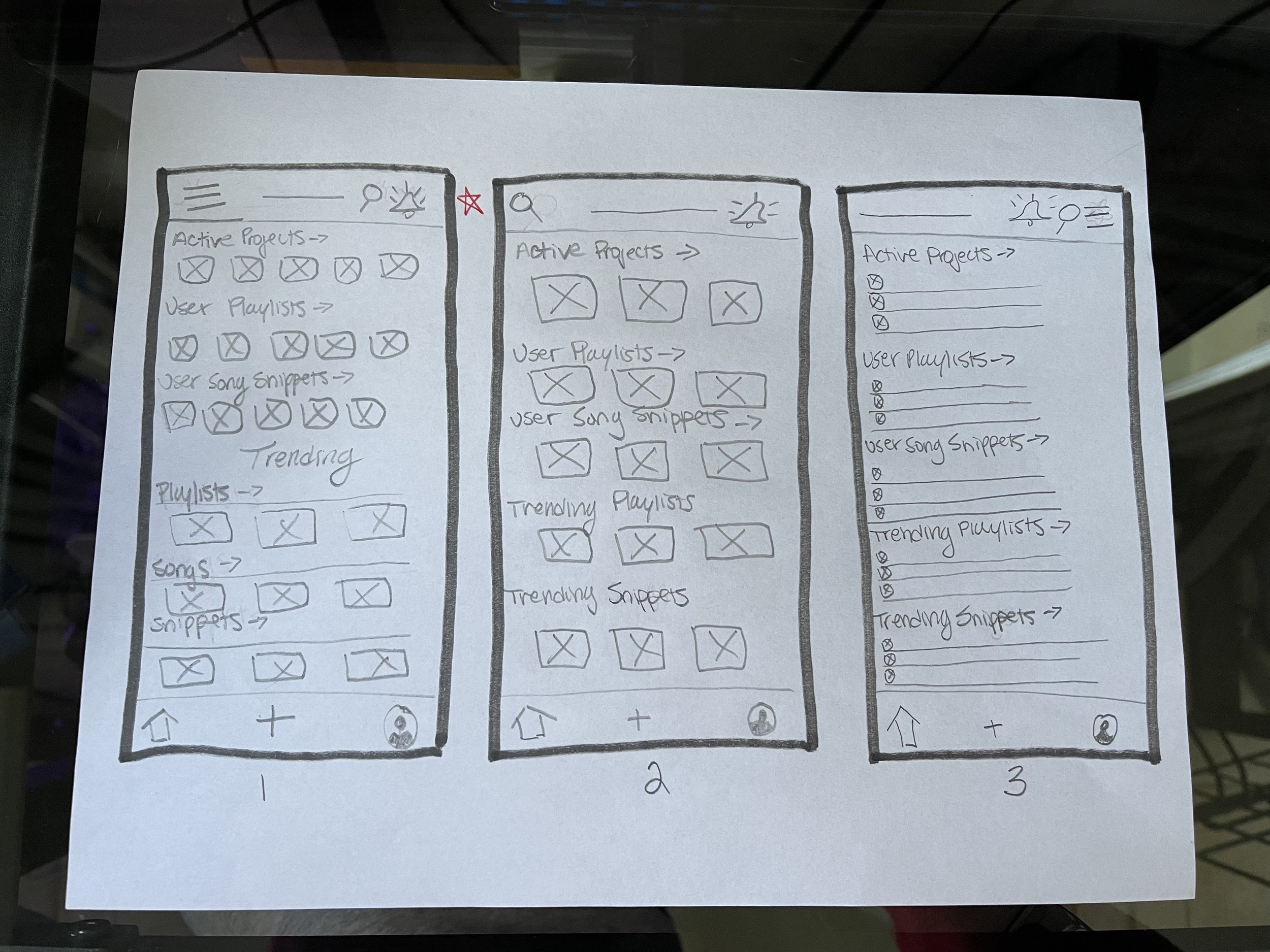
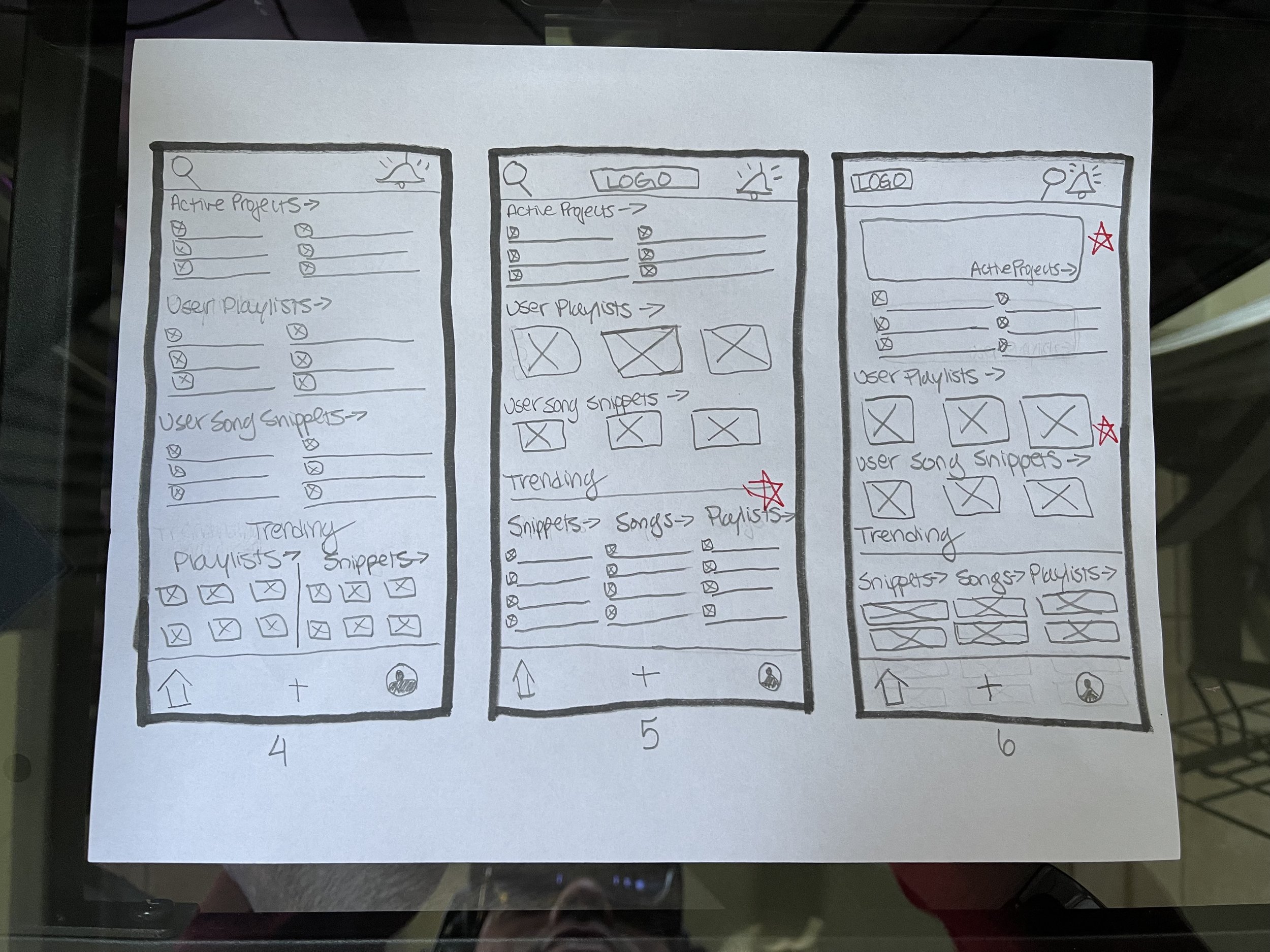
Homepage Wireframes
The homepage needed to be organized so users could easily find notifications and view their active collaborations.
I selected the best feature layouts from each of the paper wireframes and combined them to create a final homepage layout.
I eventually landed on a design that consisted of 3-4 main zones, each with separate scroll functions and icon sizes for variety.
Paper Wireframes to Digital
Choices and Takeaways
To make it easy to tell when feedback has been received, I kept the alerts icon fixed at the top right corner of the screen
To make commenting quicker, I created a section at the bottom of playlists that allows users to view comment and view each other’s feedback
Because the user will likely have multiple projects working at once, I added a zone with all of their active projects listed so they can quickly access as needed
Low-Fidelity Prototype
Click HERE for a Demo of the Low Fidelity Prototype.
After reviewing my final wireframes with a potential user, I decided to remove a feature from the overall product that did not seem useful. This provided me with more space on the homepage to highlight the user’s playlists, ultimately making the user journey more clear from the moment they enter the app.
Considering User Flow
High Fidelity Prototype
Click HERE for a demo of the High Fidelity Prototype.
While designing the final prototype, I chose to include new features that potential users mentioned might be useful when collaborating.
For example, notification alerts directly next to the collaboration titles on the home screen to make users immediately aware that they have feedback to review.
I also added the ability to add collaborators to Playlists, and once added, to tag them in comments directly within the collaboration.
Takeaways
What I Learned
Starting a project from scratch can be hard, and sometimes intimidating. As this was my first time ideating, designing, and prototyping on my own, I learned I needed to rely heavily on user research in order to create a usable and enjoyable final product. I leveraged online communities and friend networks, asking “5 Whys” whenever possible. This provided me a solid understanding of user pain points, and set me up for success when ideating solutions.
Potential Next Steps
As I continue to develop this project, I am looking to build upon the currently inactive features, such as the “Schedule”, “Portfolio”, and “Friends List”.
The “Schedule” would allow users to track upcoming performances and provide availability to potential clients direct from the app. The “Portfolio” would consist of all past collaborations featuring reviews and recommendations from clients. Lastly, I would love to develop a “Friends List” to allow the user to see the activity and availability of other musicians to plan potential collabs, concerts or events.
Thank you for reviewing my Case Study!
Please don’t hesitate reach out with any questions regarding my experience or availability.


